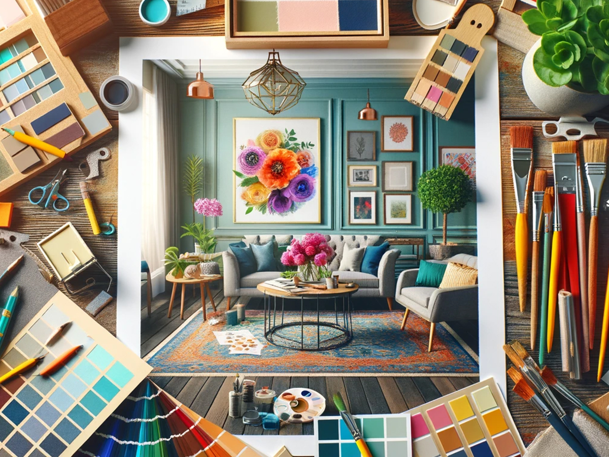
Color Theory in Interior Design: Crafting the Perfect Palette
Introduction: The Art and Science of Color in Interior Design
Color, an element so intrinsic to our perception of the world, wields the power to transform the mundane into the extraordinary. In the realm of interior design, color is not merely a choice; it is an essential tool, a language that communicates mood, style, and function. Yet, the exploration of color in interior design often gravitates towards the predictable—trends that come and go, the safe palettes that pervade portfolios. Here, we delve into the nuanced art and science of color theory, unveiling aspects seldom tread upon by traditional discourses, inviting architects, designers, real estate professionals, and homeowners to reimagine the essence of their spaces.
Beyond the Palette: The Emotional Alchemy of Color
Color theory in interior design is frequently framed within the confines of aesthetic appeal and visual harmony. However, the emotional alchemy it facilitates is profound, extending far beyond the surface. Colors do not exist in isolation; they interact, contrast, and blend, each hue imbued with the capacity to evoke distinct psychological and physiological responses. This section aims to uncover the deeper connections between color choices and their impact on the human psyche, exploring how the strategic application of color theory can transform spaces into sanctuaries that reflect, inspire, and heal.
Color as a Communicator: Crafting Narratives Through Hues
In the narrative of interior design, color serves as a dynamic storyteller. Each shade and tint possesses its own vocabulary, capable of conveying themes from tranquility to vibrancy, minimalism to opulence. This segment explores how color can be used not just as a decorative element, but as a powerful communicator that aligns with the personal stories of inhabitants, the brand identities of commercial spaces, and the cultural contexts of the environments they are part of. We will journey through the process of crafting these narratives, guiding readers to harness color as a tool for storytelling within their spaces.
This introduction sets the stage for a comprehensive exploration of color theory in interior design, emphasizing its significance not just in crafting aesthetically pleasing environments, but in creating spaces that resonate on a deeper emotional level, communicate stories, and fulfill the multifaceted needs of those who inhabit them. As we move forward, we invite our readers to look beyond the conventional, to explore the endless possibilities that thoughtful color selection can unveil, crafting environments that are not only visually stunning but are imbued with meaning, emotion, and purpose.
Psychology of Color: Unveiling the Emotional Blueprint
The psychology of color transcends aesthetic considerations, delving into the profound impact color has on human emotion, behavior, and well-being. This segment explores the intricate relationship between color and psychological response, offering insights into how interior design can leverage this connection to create spaces that do more than just look appealing—they feel right.
The Emotional Spectrum of Color
Warm Colors: Energy and Comfort
Warm colors, such as red, orange, and yellow, are known for their ability to evoke feelings of warmth, comfort, and energy. However, the emotional impact of warm colors is more nuanced than commonly appreciated. For instance, a soft peach or a muted terracotta can evoke a sense of nurturing and security, making them ideal for living spaces where comfort is key. On the other hand, brighter shades of red and orange can stimulate conversation and appetite, making them excellent choices for dining areas.
Cool Colors: Serenity and Space
Cool colors, including blue, green, and purple, are traditionally associated with calm, serenity, and spaciousness. Beyond their calming effect, cool colors can also enhance concentration and creativity. A study room painted in a soft shade of blue-green can encourage focus and innovation, while a lavender-tinted bedroom can aid in relaxation and sleep quality. These effects illustrate the potential of cool colors to transform the functionality and emotional tone of a space.
Color and Perception: Beyond the Visual
Spatial Dynamics
The psychology of color extends to its ability to alter the perception of space. Light, pastel colors can make small rooms feel larger and more open, an effect that is invaluable in the design of compact urban apartments. Conversely, dark, rich colors can create an intimate atmosphere in oversized rooms, making them feel more personal and cozy. This psychological manipulation of space is a powerful tool in the interior designer’s arsenal, allowing for the creation of environments that better meet the needs and preferences of their inhabitants.
Color and Cultural Significance
The emotional response to color is also deeply influenced by cultural contexts and personal experiences. For example, while white is often associated with purity and cleanliness in Western cultures, it may symbolize mourning in some Eastern cultures. Understanding these cultural nuances is essential for designers working in diverse and multicultural settings, ensuring that color choices resonate positively with the intended audience.
Bridging Color and Well-being
Enhancing Mood and Mental Health
Recent studies have highlighted the potential of color to influence mood and mental health. Soft blues and greens are praised for their calming effects, potentially reducing anxiety and promoting mental well-being. Incorporating these colors into environments such as healthcare facilities, schools, and workplaces can contribute to a more supportive and healing atmosphere.
Stimulating Environments
Conversely, vibrant colors like yellow and orange can energize and uplift, making them perfect for creative studios, gyms, and social spaces where high energy is desirable. These colors can stimulate mental activity and foster social interactions, contributing to a dynamic and engaging environment.
This exploration into the psychology of color reveals its vast potential not just as a design element, but as a tool for creating spaces that reflect and nurture the emotional and psychological needs of those who inhabit them. As we continue to push the boundaries of interior design, let us harness the power of color to craft environments that are not only visually stunning but deeply connected to the human experience.
Applying Color Theory to Interior Design
With a foundational understanding of color theory under our belts, we can now delve into the practical application of these principles within the realm of interior design. This section is dedicated to translating theory into practice, guiding professionals and enthusiasts alike through the nuanced process of applying color theory to create spaces that are not only visually captivating but also deeply functional and emotionally resonant.
Color Harmony in Spaces
Achieving Balance and Cohesion
Harmony in color is essential for creating a sense of balance and cohesion in interior spaces. By employing complementary, analogous, or triadic color schemes, designers can curate environments that feel unified and pleasing to the eye. This balance is crucial in residential spaces where comfort and relaxation are paramount, as well as in commercial settings that aim to welcome and engage.
Layering for Depth and Interest
Beyond simple color combinations, layering different shades, tints, and tones of a single color can add depth and interest to a space. This technique, known as monochromatic harmony, utilizes variations in lightness and saturation to create a sophisticated and nuanced palette that is visually engaging yet harmoniously unified.
Contrast and Balance: The Dynamic Duo
Utilizing Contrast Effectively
Contrast is a powerful tool in interior design, capable of drawing attention and adding visual interest to a space. However, it must be used judiciously to avoid creating environments that feel chaotic or disjointed. Strategic use of contrasting colors can highlight architectural features, define different areas within a space, and create focal points that guide the viewer’s eye.
Balancing Act
Finding the right balance between contrast and harmony is key to creating spaces that are dynamic yet cohesive. This involves not only selecting the right colors but also considering their placement and proportion within the space. Effective balance ensures that no single element overwhelms the others, allowing the room’s design to flow seamlessly.
Texture and Pattern: Complementing Colors
Enhancing Color Schemes
Texture and pattern play vital roles in enhancing and complementing color schemes in interior design. Textural variations can add depth to monochromatic schemes, while patterns can introduce complexity and rhythm to spaces, making color schemes more dynamic and engaging.
Strategic Use of Textures and Patterns
The strategic use of textures and patterns can also influence the perception of color in a space. Glossy surfaces reflect light, making colors appear lighter and more vibrant, while matte surfaces absorb light, rendering colors deeper and more subdued. Patterns can break up large expanses of color, adding visual interest and helping to balance the overall composition of the space.
Crafting the Perfect Palette for Different Spaces
Selecting the ideal color palette is a nuanced process that goes beyond mere aesthetic preference, requiring a deep understanding of the function of the space, the psychological effects of colors, and the cultural context. This section explores how to craft the perfect palette tailored to different types of spaces, ensuring that each environment not only looks beautiful but also fulfills its intended purpose and resonates with its occupants.
Residential Design: Harmonizing Style and Comfort
Personal Style Meets Functionality
In residential settings, the color palette must reflect the inhabitants’ personal style while promoting comfort and functionality. For living rooms, soft, warm hues can create a welcoming atmosphere, encouraging relaxation and social interaction. Bedrooms benefit from cooler tones, such as soft blues and greens, promoting rest and tranquility. The key is to blend personal preferences with colors that enhance the room’s purpose, creating a cohesive and comfortable home.
Children’s Spaces: Vibrancy and Growth
Designing for children requires a dynamic approach to color, incorporating vibrant hues that stimulate creativity and learning. However, it’s essential to balance energy with calmness, using softer shades in areas designated for rest. Integrating flexible color schemes that can evolve as the child grows ensures the space remains relevant and engaging.
Commercial Spaces: Aligning with Brand Identity
Branding Through Color
Commercial spaces must consider brand identity when selecting a palette. Colors can be a powerful tool in conveying a brand’s values and personality, from the sophistication of monochromatic schemes to the vibrancy of bold, contrasting colors. The palette should enhance the customer experience, creating an environment that strengthens brand recognition and loyalty.
Functional Aesthetics in Workspaces
Office spaces benefit from colors that enhance productivity and well-being. Neutral backgrounds with strategic pops of color can stimulate focus and creativity, while common areas may feature brighter, more energizing colors to foster collaboration and dynamism.
Cultural and Contextual Considerations: A Global Perspective
Respecting Cultural Influences
Color choices must be sensitive to cultural contexts, especially in spaces that serve diverse populations. Research and understanding of cultural preferences and meanings associated with colors are crucial to creating environments that are welcoming and respectful to all users.
Adaptive Color Strategies
The function of the space and its geographical location can also influence color selection. For instance, a spa in a tropical location might feature lush greens and ocean blues to reflect the natural surroundings, while a restaurant in a historical district might opt for richer, deeper tones to harmonize with its environment.
Conclusion: The Transformative Power of Color
The exploration of color theory in interior design culminates in a profound appreciation for the transformative power of color. This journey, from the basics of the color wheel to the nuanced application of color in various spaces, underscores color’s unparalleled ability to alter perceptions, evoke emotions, and create atmospheres that enhance the human experience. As we reflect on the insights shared, it becomes evident that color is not just a design element but a pivotal tool in crafting environments that resonate on multiple levels.
Beyond Aesthetics: Color as a Catalyst for Well-being
Enriching Lives Through Color
The thoughtful application of color theory goes beyond mere aesthetics, serving as a catalyst for well-being and comfort. Spaces designed with a deep understanding of color psychology offer more than just visual appeal; they provide sanctuaries that support mental health, foster productivity, and inspire creativity. This holistic approach to design places equal emphasis on the psychological and functional aspects of space, highlighting the role of interior designers in enhancing the quality of life through color.
Embracing the Future with Color
Innovation and Sustainability
Looking ahead, the role of color in interior design is set to evolve further, embracing innovation and sustainability. As designers, we are tasked with staying abreast of emerging trends, technological advancements, and the growing emphasis on eco-friendly practices. Incorporating sustainable materials and considering the environmental impact of our color choices will not only align with contemporary values but also contribute to the creation of spaces that are both beautiful and responsible.
The Journey Continues
A Lifelong Exploration
The study and application of color theory in interior design is a lifelong exploration, one that challenges us to continuously learn, experiment, and refine our approaches. Each project presents an opportunity to delve deeper into the emotional and psychological nuances of color, crafting spaces that truly reflect the complexities of human experience.
As we conclude this exploration of color theory, let us carry forward the understanding that color is a powerful tool in shaping the world around us. By applying these principles with sensitivity and creativity, we can continue to transform spaces into environments that not only look exceptional but also feel deeply connected to the people who inhabit them. In the dynamic field of interior design, our journey with color is ever-evolving, offering endless possibilities to enrich and inspire the lives of those we design for.