Creating a Gallery Wall: Tips for a Cohesive Look
The Importance of Planning
Creating a gallery wall, a curated display of photographs, artwork, and mementos, is more than just hanging frames on a wall. It’s an art form that requires thoughtful planning and consideration. The planning phase is crucial, not just for achieving a visually pleasing outcome but for ensuring that the gallery wall reflects the personal style or brand identity of the owner and complements the space it inhabits. This section delves into aspects of planning that are often overlooked yet vital for creating a cohesive and impactful gallery wall.
Visualizing Your Space
One of the most innovative yet underutilized steps in planning a gallery wall is the use of 3D renderings. Traditional methods of visualization, such as sketching layouts or using paper templates, offer a rough idea but lack the ability to fully capture the essence of the intended design. 3D renderings, on the other hand, allow for an immersive preview of how the gallery wall will integrate with the existing space, furniture, and decor. This technology enables homeowners, interior designers, and commercial business owners to experiment with different arrangements, frame sizes, and styles without the physical limitations or the need for imagination. It’s a step that bridges the gap between concept and reality, ensuring that every piece contributes to the desired aesthetic and emotional impact.
Selecting a Theme or Style
A cohesive gallery wall requires a unifying theme or style, a concept often glossed over in traditional discussions on the subject. While the selection of individual pieces is usually driven by personal taste, integrating them into a cohesive display demands a deeper understanding of how different elements complement each other. This is where the importance of a thematic or stylistic anchor comes into play. Whether it’s a color scheme, an artistic period, or a thematic concept, choosing a central theme ensures that the gallery wall tells a story, rather than presenting a disjointed collection of images. This approach not only enhances the visual appeal of the wall but also imbues it with a sense of purpose and meaning.
Choosing the Right Pieces
Selecting the perfect pieces for your gallery wall is a critical step that transcends basic aesthetics, venturing into the realm of personal expression and storytelling. This section explores the nuanced considerations involved in choosing the right pieces for a gallery wall, emphasizing unique perspectives that are seldom discussed within the industry.
Curating with Intention
The act of curating art for a gallery wall should be an intentional process, one that goes beyond simply picking out attractive pieces. Each selection should contribute to a larger narrative or aesthetic vision, making the wall more than just a collection of items—it becomes a curated exhibition of personal history, artistic appreciation, or brand identity. For instance, incorporating pieces that have a backstory or a special meaning to the owner adds layers of depth and intrigue, turning the gallery wall into a conversation starter and an embodiment of the owner’s journey or brand’s ethos.
Mixing Mediums and Textures
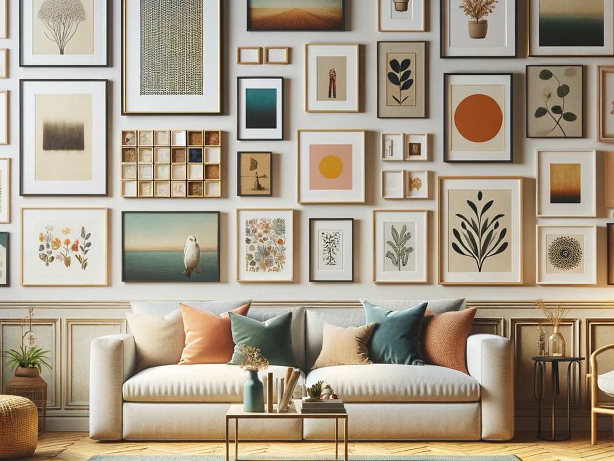
A commonly overlooked aspect in curating pieces for a gallery wall is the strategic use of different mediums and textures. Including a mix of photographs, paintings, prints, and three-dimensional objects can transform a flat display into a dynamic visual experience. Textural diversity adds depth and character, creating a more engaging and tactile gallery wall. For example, juxtaposing glossy photographs with matte paintings or incorporating woven textiles alongside metal sculptures can enhance the sensory appeal of the collection, making it more memorable and impactful.
Size and Framing Considerations
The selection of sizes and frames is pivotal in achieving a cohesive look, yet it requires a balance between uniformity and diversity. A common misconception is that frames must match to create cohesion. However, mixing frame styles, colors, and sizes can add visual interest and depth when done thoughtfully. The key is to maintain a certain element of consistency, such as a color scheme or frame thickness, that ties the collection together. Additionally, considering the size of each piece in relation to others and the overall space ensures that the gallery wall is scaled appropriately, avoiding a cluttered or sparse appearance.
Embracing Negative Space
The use of negative space, or the empty space around and between the pieces, is a sophisticated design principle that is often undervalued in gallery wall composition. Proper utilization of negative space ensures that each piece has room to “breathe,” allowing individual works to stand out while contributing to the overall harmony of the display. It’s a delicate balance that requires forethought and experimentation, often leveraging 3D rendering tools for precision. This approach not only enhances the aesthetic appeal of the gallery wall but also influences the viewer’s interaction with the artwork, guiding their gaze through the curated journey in a deliberate manner.
Layout Design
The layout of a gallery wall is where creativity meets precision. It’s the stage where individual pieces are arranged to tell a story, evoke emotion, or convey a brand’s identity. This section delves into the strategic considerations behind designing a gallery wall layout, providing insights that go beyond conventional wisdom to offer a fresh perspective on creating harmony and impact.
The Art of Balance
Creating a balanced gallery wall is an intricate process that involves more than just evenly spacing frames. It’s about achieving visual harmony among diverse elements, where the weight of each piece—be it color intensity, size, or thematic gravity—is counterbalanced across the display. This concept of balance doesn’t necessarily mean symmetry. Asymmetrical arrangements can offer dynamic and visually intriguing layouts that captivate the viewer’s attention. The art lies in arranging pieces so that the wall feels cohesive and balanced, regardless of the symmetry. Utilizing software to mock up arrangements can provide a preview, allowing adjustments before any nails are hammered.
Symmetry vs. Asymmetry
Deciding between a symmetrical and asymmetrical layout depends on the room’s existing decor, the style of the pieces, and the desired atmosphere. Symmetrical layouts provide a sense of order and formality, suitable for spaces aiming for a classic, understated elegance. On the other hand, asymmetrical arrangements offer a more casual, organic feel, ideal for contemporary spaces or to express personal quirks and preferences. This choice significantly affects the viewer’s experience, making it essential to consider the overall design objective of the space.
Utilizing Floor Plans
The role of detailed floor plans in designing a gallery wall layout is often underestimated. Floor plans offer a bird’s-eye view of the space, enabling designers and homeowners to consider the gallery wall within the context of the room’s overall layout, furniture placement, and traffic flow. This holistic perspective ensures that the gallery wall enhances the space without overwhelming it. For instance, a gallery wall in a living room should complement the seating arrangement, becoming a focal point without obstructing views or making the space feel cluttered. Incorporating floor plans into the layout design process ensures the gallery wall is harmoniously integrated into the environment, maximizing its aesthetic and functional impact.
Dynamic vs. Static Layouts
Choosing between a dynamic or static layout involves considering the energy and movement you wish to infuse into the space. Dynamic layouts, characterized by varying frame sizes and an asymmetrical arrangement, inject vitality and keep the eye moving. Static layouts, with uniform frames and a symmetrical arrangement, offer calmness and stability. The decision should align with the room’s purpose and the ambiance one aims to create, making the gallery wall a true reflection of the space’s identity.
Installation Tips
The installation of a gallery wall is the culmination of all the planning, curating, and designing that has gone into the project. It’s a critical phase where precision and attention to detail can significantly influence the final outcome. This section provides unique and advanced tips for installing a gallery wall, focusing on methods and considerations that are often overlooked but can make a substantial difference in the execution and longevity of the display.
Advanced Measuring Techniques
While the basic rule of measuring twice and cutting once applies, there are more nuanced measuring techniques that can elevate the installation process. For instance, using a laser level can ensure that your artworks are perfectly aligned, even in rooms where the floors or ceilings may not be level. Another technique involves creating a full-scale paper template of your gallery wall layout. By arranging paper cutouts on the wall, you can visualize the final arrangement, make precise placement decisions, and mark nail positions directly on the templates, minimizing mistakes and unnecessary holes in the wall.
The Right Hardware for Your Wall Type
The type of wall—be it drywall, plaster, or brick—dictates the kind of hanging hardware required for a secure installation. This consideration is often glossed over, leading to damage or instability in the arrangement. For example, plaster walls may require different anchors than drywall to prevent cracking or crumbling. Similarly, installing on brick walls might necessitate special drill bits and anchors. Selecting the appropriate hardware ensures that each piece is securely mounted and that the gallery wall remains intact over time.
Lighting Considerations
Optimal lighting can dramatically enhance the impact of a gallery wall, yet it’s frequently an afterthought. The right lighting setup can accentuate colors, textures, and details in the artwork, transforming the visual experience. Consider integrating adjustable track lighting or picture lights to highlight specific pieces. Additionally, the direction and intensity of the light should be considered to avoid unwanted shadows or glare, which could detract from the display’s visual appeal.
Adjustability for Future Changes
A unique but practical installation tip is to plan for adjustability and future changes. Gallery walls can evolve, with pieces being added or replaced over time. Using systems that allow for easy adjustments, such as picture hanging rails or magnetic paint and magnets, can offer flexibility. These systems enable homeowners and designers to refresh the gallery wall without additional drilling, keeping the space dynamic and allowing the collection to grow and change with minimal effort.
Protecting Your Artwork
Protecting the artwork during and after installation is crucial, especially in environments prone to humidity or direct sunlight. Using UV-protective glass in frames can prevent fading, while ensuring there’s adequate air circulation behind framed pieces can guard against mold. These protective measures are essential for preserving the integrity and appearance of the gallery wall over time.
Final Adjustments for Cohesion
After installation, taking a step back to review the gallery wall as a whole is vital. This is the time to make final adjustments to spacing or alignment, ensuring that the gallery wall achieves the desired level of cohesion and visual impact. It may also be beneficial to view the arrangement at different times of the day, as changing light conditions can reveal new perspectives on balance and color harmony.
Final Touches
The final touches to a gallery wall are what transform it from a mere collection of pieces into a harmonious and impactful element of a room’s design. This phase is about refining and enhancing the gallery wall to ensure it fully integrates into the space and resonates with its intended audience. Below, we delve into nuanced and often overlooked aspects of adding those final enhancements that elevate the overall aesthetic and experience of a gallery wall.
Integrating Ambient Lighting
Ambient lighting plays a pivotal role in how a gallery wall is perceived. Beyond the focused lights that may highlight individual pieces, ambient lighting can set the mood and draw attention to the gallery wall subtly. Consider soft, indirect lighting that can illuminate the wall without causing glare on glass surfaces. Dimmable LED strips placed behind frames or along the edges of the gallery can create a soft glow that enhances the visual appeal and draws the eye towards the display, making it a focal point even in low-light conditions.
Adding Textural Contrast
While the artwork itself is the star of any gallery wall, the inclusion of elements with varying textures can add depth and interest to the display. Consider the addition of small sculptural elements, fabric pieces, or even plants that can introduce organic shapes and textures. These elements should complement rather than compete with the artwork, serving to frame and accentuate the collection while adding a layer of visual richness to the space.
Reflective Elements for Depth
Incorporating reflective elements such as mirrors or metallic frames within the gallery wall can enhance the sense of depth and space. Mirrors, in particular, can reflect natural light and views, integrating the gallery wall more seamlessly into the room’s environment. This technique is especially effective in smaller spaces, where the reflective quality can create the illusion of a larger, more open area.
Cohesion Through Color and Theme
As a final check for cohesion, revisit the color scheme and thematic elements of your gallery wall in relation to the room’s overall design. Adjusting small details, such as the matting color in frames or the hue of accent pieces, can fine-tune the visual harmony between the gallery wall and the surrounding space. This careful consideration ensures that the gallery wall complements the interior design, enhancing the aesthetic and emotional impact of the room.
Conclusion
Reflecting on the Journey
Creating a gallery wall is an artful journey that extends beyond mere decoration; it’s a form of personal or brand expression that imbues a space with life, narrative, and connection. This article has traversed the meticulous process of planning, curating, designing, and installing a gallery wall, highlighting the nuanced considerations that elevate a collection of pieces into a cohesive and impactful display.
The Essence of Cohesion
At the heart of a successful gallery wall is the principle of cohesion—a delicate balance achieved through thoughtful planning, intentional selection, and strategic design. Cohesion ensures that each piece, while unique, contributes to a harmonious whole, enhancing the aesthetic and emotional resonance of the space.
The Role of Innovation
We’ve explored how leveraging innovative tools like 3D visualization and advanced installation techniques can transform the gallery wall process, offering precision and flexibility while ensuring that the final display is both captivating and enduring. These approaches underscore the importance of embracing both creativity and technology in interior design.
A Canvas for Expression
Ultimately, a gallery wall is a canvas for expression, reflecting individual stories, brand identities, or artistic visions. It’s a testament to the power of visual storytelling, where each element plays a part in crafting a narrative that engages, inspires, and transforms.
As we conclude, remember that the journey of creating a gallery wall is as rewarding as the outcome. It’s an opportunity to explore, experiment, and express, turning a blank wall into a masterpiece of personal significance or brand representation. Whether you’re an interior designer, a homeowner, or a commercial business owner, the insights shared here aim to inspire and guide you in creating a gallery wall that truly resonates, leaving a lasting impression on all who encounter it.


